Project: UMAI – Japanese Sauce and Seasoning
Personal branding and packaging design project
Role: Concept Developer & Designer
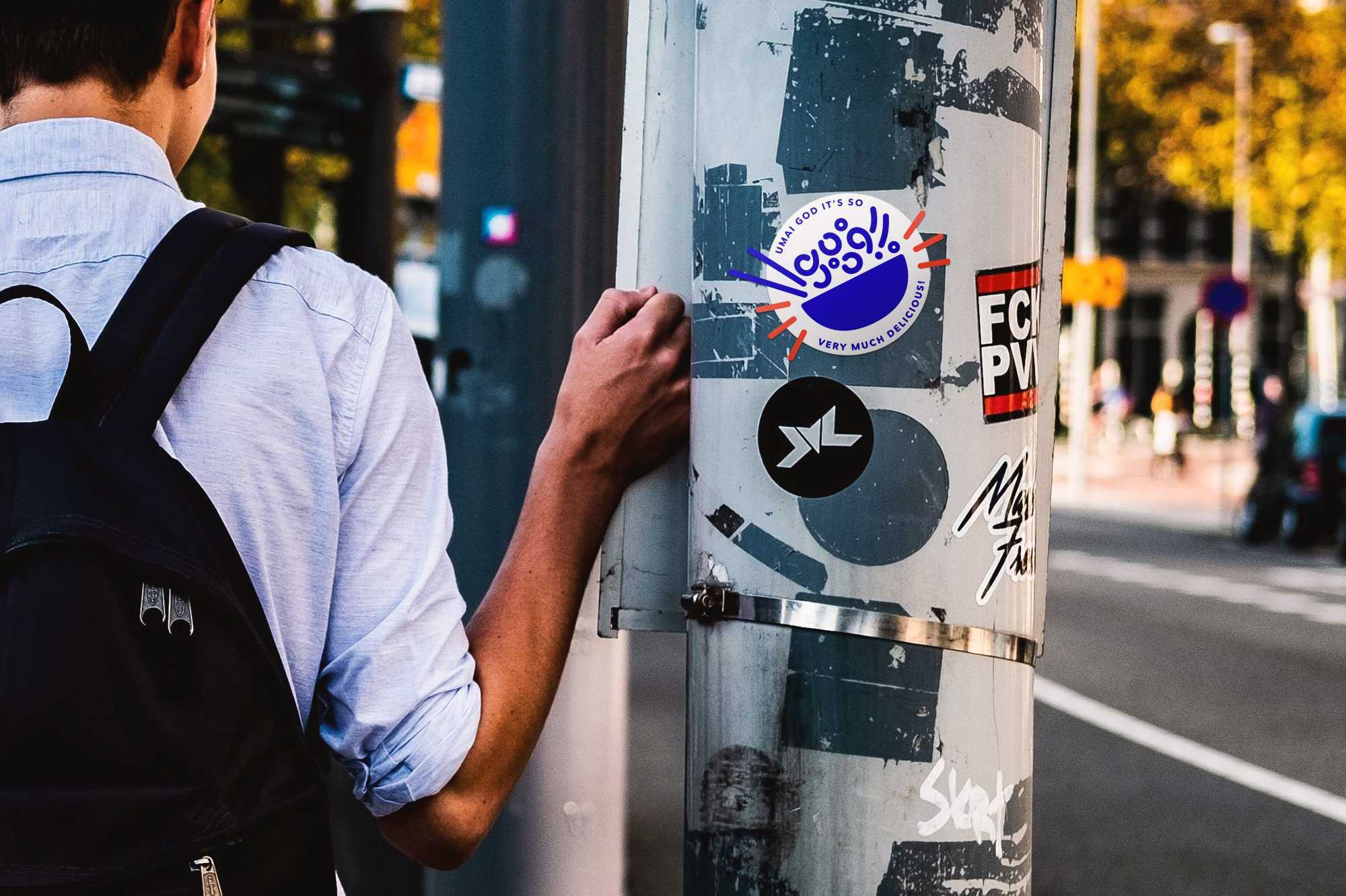
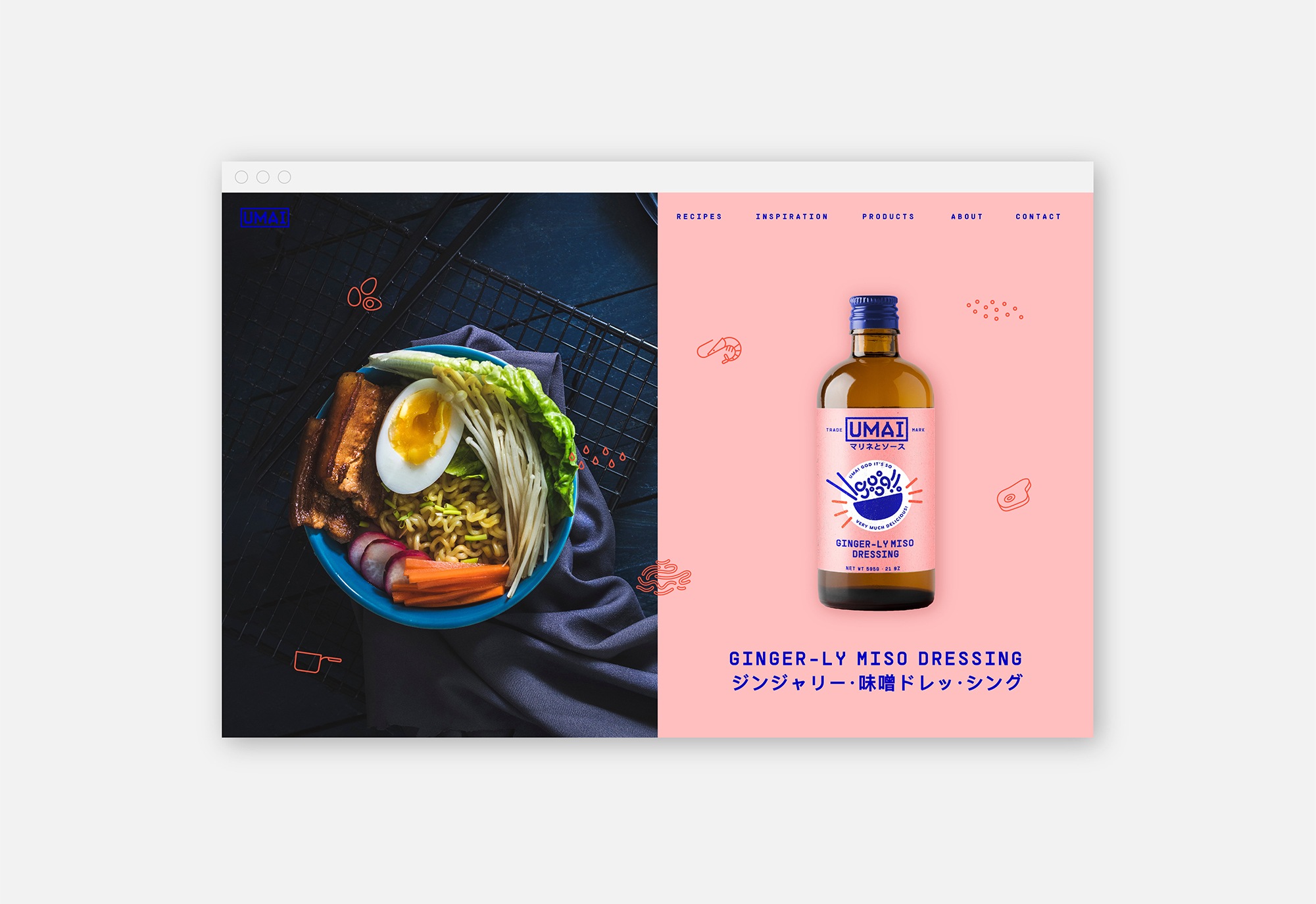
Umai means “tasty” or “delicious” in Japanese, and the name also plays on its phonetic similarity to umami — the essential savory taste in Japanese cuisine. Paired with the playful phrase Umai God, the brand strikes a quirky and memorable tone that runs through the entire identity. This playfulness is balanced with structured, minimalist typography to create a sense of clarity and refinement.
The logotype draws inspiration from traditional Japanese woodblock prints, anchoring the brand in cultural heritage. Each flavor is color-coded, with a bold noodle bowl illustration taking center stage across packaging — making the product both eye-catching and easy to navigate on the shelf.
What began as a client brief from a Japanese restaurant with ambitions to launch their line of sauces evolved into a personal design project, which I completed independently. The concept includes both name development and full visual identity design.