Kalles Kaviar – Packaging Redesign
In collaboration with Scandinavian Design Group
Role: Designer (Team Member)
The iconic Swedish brand Kalles Kaviar was given a subtle yet fresh update to better connect with a younger audience and reclaim its place in the modern fridge. I was part of the design team at Scandinavian Design Group responsible for developing the updated packaging.
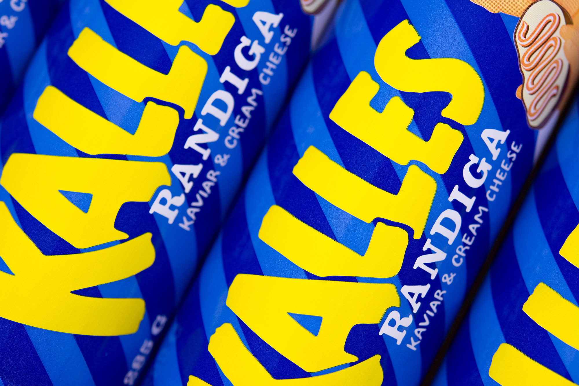
The new design introduces a friendlier and more approachable tone through a slightly naïve, handwritten typographic style. The logotype was carefully refined — its letters subtly tilted and adjusted to improve balance and form, while maintaining recognizability. These nuanced changes make the logotype feel more personal and handcrafted.
A key element of the redesign was elevating the MSC certification — a crucial marker of responsible sourcing and sustainability. Rather than letting it disappear in small print, I highlighted it using hand-drawn lettering, which I created by writing and scanning my version to give it a more unique and human expression.
Additional refinements were also made to the Kalle character illustration, enhancing the overall harmony of the updated packaging without losing its iconic identity.